Showing posts with label Stylized Facts. Show all posts

Friday, November 24, 2017

Data and Code for "Energy and Economic Growth: The Stylized Facts" and an Erratum

Following a request for our estimation code we have now completed a full replication package for our 2016 Energy Journal paper and uploaded it to Figshare.

While we were putting this together we noticed some minor errors in the tables in the published paper. The reported standard errors of the coefficients of lnY/P in Tables 2 and 3 for the results without outliers are incorrect. We accidentally pasted the standard errors from Table 5 into Tables 2 and 3. The correct versions of Tables 2 and 3 should look like this:


The standard errors for unconditional convergence in Tables 4 and 6 are also incorrect. The reported standard errors are not robust and one was completely wrong. The tables should look like:


None of these errors results in the significance level in terms of 1%, 5% etc. changing.

Friday, September 2, 2016

The Electricity "Cost Share"

This graph shows the value of electricity divided by GDP for 130 countries in 2013 plotted against GDP per capita. I used the 2015 price of electricity reported by the World Bank Doing Business report, IEA data on electricity use in 2013 and GDP data from the Penn World Table. Cost share is in inverted commas because GDP isn't gross output and electricity is used for consumption as well as production. The fitted curve is a quadratic.

There is a general trend to lower cost shares at higher income levels. But the electricity cost share is very low in some poor countries like Ethiopia simply because they don't use much electricity. It is also low in many oil producing countries such as Kuwait who subsidize electricity. In Kuwait a kWh costs 0.7 U.S. cents. By contrast, in Jamaica a kWh cost 41.6 U.S. cents. The highest cost share is in Macedonia.

I think we should expect that total energy cost shares will be more declining with income. This is because poor countries use more of other energy sources and rich countries use less of energy other than electricity. This matches the longitudinal data we have from Sweden and Britain.

I put this data together for our Energy for Economic Growth project.

Monday, July 6, 2015

Energy Leapfrogging (or Not)

Arthur van Benthem has a recent paper in the Journal of the Association of Environmental and Resource Economists titled "Energy Leapfrogging". The main thesis of the paper is that despite presumed improvements in the energy efficiency of individual technologies such as cars and refrigerators, energy intensity in developing countries today is similar to what it was in today's developed countries when they were at a similar income level. There is no "energy leapfrogging". This is also an implication of our paper "Energy and Economic Growth: the Stylized Facts". If there has been an almost constant log-linear relationship between energy use and GDP per capita then there is no energy leapfrogging.

van Benthem suggests that a major contributor to this is that the consumption bundle in developing countries today is much richer in energy services like personal transport than was the consumption bundle at a similar level of development in today's developed countries. Consumers have substituted towards these now cheaper energy services (what are they consuming less of though?).

On the face of it, this suggests that there would be a very large rebound effect due to substitution towards energy services. This is on top of any indirect rebound effect due to increased energy productivity boosting income and thus energy demand as originally proposed by Harry Saunders.

On the other hand, there must be some shift away from energy services as income increases so that energy intensity is lower in richer countries. Anyway, this is pretty speculative but worth thinking about, I think.

Sunday, March 8, 2015

Energy Prices, Growth, and the Channels in Between: Theory and Evidence

Lucas Bretschger has an interesting new paper in Resource and Energy Economics titled: "Energy prices, growth, and the channels in between: Theory and evidence". The paper argues that countries with higher energy use per capita grow slower in the long-run though reductions in energy use lower output in the short-run. The long-run effect is due to an induced increase in capital accumulation and because the model is similar to AK endogenous growth models, innovation. The paper is motivated by the stylized fact that in a sample of 37 countries, countries with higher per capita energy use grow slower. The sample includes mostly developed countries but also China and India.

This negative correlation is, however, easy to explain in terms of catch-up growth dynamics. As we show in our stylized facts paper, there is a strong positive correlation between the level of GDP per capita and the level of energy use per capita. Per capita income in countries such as China and India has risen faster than in the developed countries due to the fact that they are poorer and undergoing catch-up growth. This results in a spurious negative relationship between energy use per capita and the rate of economic growth.

This is not to say at all that Bretschger's theoretical model is wrong, but the motivation can easily be explained in another way. In fact, I'm very sympathetic to the idea that plentiful energy resources could slow the rate of economic growth as I discussed in my presentation at the AARES conference in Rotorua and my upcoming Arndt-Corden seminar on 17th March.

Bretschger also estimates an econometric model that is loosely related to his theoretical model (for example, using energy quantity rather than price due to a lack of internationally comparable data - a big problem for energy economics) that regresses the investment/output ratio on energy intensity and GDP (there are additional equations). It is not surprising that reduced energy intensity could encourage increased investment if it represents increased energy efficiency - this is one of the factors in macro-level rebound as in Harry Saunders (1992) model.

The bottom line is that the energy-output relationship is quite complicated and is probably not at all well captured by reduced form time series models. Bretschger is also making this point with his paper.

Wednesday, December 17, 2014

Global Energy Use: Decoupling or Convergence?

I have another new working paper coauthored with Zsuzsanna Csereklyei out titled: "Global Energy Use: Decoupling or Convergence?". This paper follows up on our paper on the the stylized facts of energy and growth using the methods from our paper on modeling the emissions-income relationship using long-run growth rates.
In particular, we focus on the stylized facts that there is a stable relationship between energy use and GDP per capita over time and that there has been convergence in energy intensity over time.

The following graph shows the relationship between the long-run growth rates of energy use and GDP per capita from 1971 to 2010:
As we saw in our previous paper, higher economic growth rates are associated with higher rates of growth in energy use, though there is quite a lot of variation in individual countries. As the intercept of the regression line is zero, on average there is no time effect that is reducing energy use across all countries in the absence of economic growth. On the other hand, many developed countries like the UK, Sweden, or even the United States have seen declines or little increase in energy use per capita in recent decades. So, what can explain that?

Our model adds additional explanatory variables to the regression illustrated above. To test whether there is decoupling, so that growth has less effect or even a negative effect on energy use at higher income levels we include an interaction term between the growth rate and level of income per capita. This is the same idea as the test for the environmental Kuznets curve in the Anjum et al. paper. We find that the regression coefficient for this interaction term is actually positive! So, actually growth has larger rather than smaller effects on energy use in higher income countries. However, we find that the level of income has a negative effect on the growth rate of energy use. This means that at higher income levels there is an improving energy efficiency effect so that energy use declines over time ceteris paribus. We call this "weak decoupling". The following graph shows the contribution of these and other effects to the growth in energy use in different groups of countries:
Though, as shown by the black dots, the growth rate of energy use  per capita is highest in upper middle income countries, the contribution of economic growth is greater in high income countries. But this positive effect of growth is offset by "weak decoupling" and other effects.

The most important of these other effects globally is convergence. Countries that had high energy intensities at the beginning of the period saw declines in energy intensity, ceteris paribus. But, this effect was most important in the low income countries, some of which were the most energy intensive in our sample in 1971. In the high income countries, convergence raised energy use on average. But in the US and Canada it contributed -1.0% and -0.9% p.a., respectively, to reducing energy use. So, there is a lot of variation across countries.

Projections and forecasts of future energy use should not, therefore, assume that economic growth will be associated with decreased energy use in the future. Instead, the scale effect seems to be alive and well. On the other hand, there appear to be improvements in energy efficiency across high income countries irrespective of their growth rates or their initial level of energy intensity. These would tend to moderate the growth in energy use as countries get richer at the upper end of the income continuum. At the lower end of the income continuum the same effects serve to raise energy intensity. But, some of the major reductions in energy intensity in countries, such as in the United States and China, have probably been the result of convergence towards the global mean, and so are unlikely to be reproduced in the future.

On the more technical side there are a couple of innovations in this paper too. We extend the method we used in the growth rates paper to allow for a spatially correlated error term. If there are omitted variables which are spatially correlated and the explanatory variables are also spatially correlated then it is likely that the two are correlated and regression coefficient estimates will be inconsistently estimated. To deal with this problem we use an approach called spatial filtering. This removes the spatial autocorrelation by adding additional variables to the regression which model the spatial process. These are in fact the eigenvectors of a transformation of the spatial weighting matrix. With 93 countries there are 93 eigenvectors, so the tricky part is deciding which of these eigenvectors to include in the regression. Tiefelsdorf and Griffith (2007) developed a procedure to do this, which we use.

Another issue is that if we want to give our model a causal interpretation, then we have to assume that GDP growth causes growth in energy use and not vice versa. Obviously changes in energy use might also cause GDP. We argue though that the latter effect is probably quite small compared to the effect of GDP on energy and so the estimated effect of GDP on energy is only biased upwards by a relatively small amount. The income elasticity of energy is likely to be close to unity whereas the elasticity of GDP w.r.t. to energy might be only 0.05. This is possibly one reason why it has been so hard for researchers to find robust signs of Granger causality from energy use to GDP. On other hand, this is maybe why a simple naive regression of GDP on energy use appears to find a very large effect of energy on GDP. The estimated regression coefficient is biased upwards by the effect of income on energy demand.

Tuesday, November 11, 2014

Stylized Facts Paper Accepted for Publication

My paper with Zsuzsanna Csereklyei and Mar Rubio: "Energy and Economic Growth: The Stylized Facts" has been accepted for publication in the Energy Journal. I've already blogged quite a bit about the paper so won't repeat that here. What is new is that we also now have a working paper version available. The working paper version has color figures, which I think are prettier and easier to understand in some cases than the black and white ones we had to use for publication.

Tuesday, September 30, 2014

Upcoming Seminars


I am giving three seminars in Europe in October and November. First up is 28th October at 1pm at the Grantham Research Institute on Climate Change at the London School of Economics. I will talk about "Energy Transitions and the Industrial Revolution." Then on 12th November at 2:15pm I will talk at the Department of Economic History at Lund University. Topic: "Energy and Economic Growth: The Stylised Facts"  - a topic that blog readers should be pretty familiar with by now.


Finally, I will be presenting at the University of Kassel in Germany on 18th November. More details to come.

Sunday, August 17, 2014

Jakob et al. (2012) Revisited

A recent paper by Jakob et al. (2012) finds that there is decoupling between growth in energy use and growth in GDP in developed countries. The authors regress the first differences between five year period means of log per capita energy use on the same transformation of GDP per capita separately for panels of OECD and non-OECD countries. They have 21 OECD and 30 non-OECD countries between 1971 and 2010. They estimate that the elasticity in developing countries is 0.631 (standard error = 0.167) and in developed countries -0.181 (0.343).

I was curious why these results are very different from those in our stylized facts paper where we find a stable monotonic relationship between energy use and PPP GDP per capita over the 1971-2010 period for 99 countries (75 non-OECD, 24 OECD) with an elasticity of around 0.70. Obviously, Jakob et al.'s method is different, their sample is smaller, and they also use market exchange rates. So, I re-estimated their model using our dataset. I find that the elasticity in developing countries is 0.395 (0.081) and in OECD countries 0.479 (0.078). This is in line with our stylized facts results. The numbers are lower probably due to using differences and country and time fixed effects.

In supplementary material, Jakob et al. report that when they use PPP GDP data from the World Development Indicators the elasticity estimates are 0.626 (0.180) and -0.353 (0.474) for non-OECD and OECD countries respectively. I would have doubted that the differences are mostly due to the different source of PPP data  - we used the Penn World Table - but our OECD sample only includes three countries omitted by Jakob et al. So, this will need further investigation.

Reference

Jakob, M., M. Haller, and R. Marschinski (2012). “Will History Repeat Itself? Economic Convergence and Convergence in Energy Use Patterns.” Energy Economics 34: 95–104.

Thursday, June 19, 2014

Energy and Economic Growth: The Animated GIF

It seems that everyone loves the animation of energy use per capita and GDP per capita that I am showing as part of my presentations on Energy and Economic Growth: The Stylized Facts. So, at James Hamilton's suggestion and with Zsuzsanna's help I have made an animated GIF of this slide sequence:

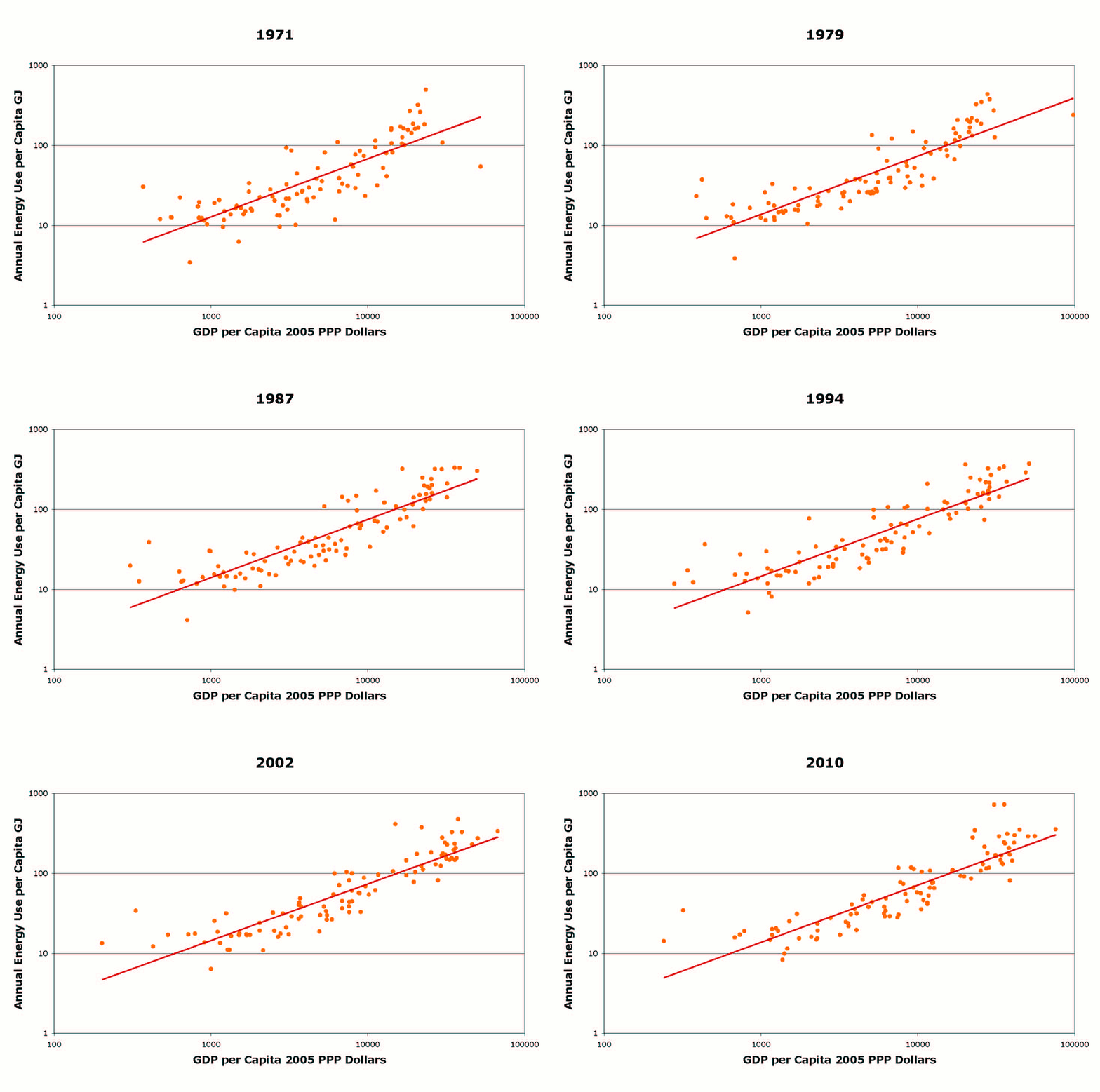
The graph is for the 99 countries that have data in both the Penn World Table (7.0) and the IEA Energy Balances. The line is the best fit log-log regression computed by Excel. As you can see the relationship between these two variables has been very stable over the last forty years globally.

Wednesday, June 18, 2014

World Energy Use Increased 2.3% in 2013

The annual BP Statistical Review was just released. It shows that world energy use increased by 2.3% in 2013. According to the IMF, the world economy grew 3% in 2013. World population is growing at about 1.1% p.a. Therefore, there was a 1.2% increase in per capita energy use for a 1.9% increase in GDP per capita - a ratio of 0.63 - which is a little below our stylized fact that energy use tends to increase by 0.7% for a 1% increase in GDP.

Thursday, June 5, 2014

Energy and Economic Growth: The Stylized Facts

I contributed an article to the IAEE Energy Forum as part of their report on the New York City conference of IAEE. The topic of our paper that I will present in New York on 16th June is "Energy and Economic Growth: The Stylized Facts". The full paper is available as part of the conference proceedings. This has been a project under development for a while, being the subject of my "foundation seminar" (=inaugural lecture) here at Crawford School. Things progressed further once Zsuzsanna Cserekylei put a consistent dataset together for the 1971-2010 period and did the analysis. Then Mar Rubio contributed historical data and analysis. Anyway, this is the text of our article:

What overall patterns, or stylized facts, characterize the relationship between economic growth and energy use both across countries and over time? Energy economists and economic historians have investigated these issues, but existing research has either looked at how energy use and economic development vary across countries at one point in time or how they evolve over time in individual countries or groups of countries. Researchers have not linked together the cross-sectional and time series behaviors despite their obvious dependence on each other.

We investigate the links between the time and cross-sectional (or income per capita) dimensions using two datasets. One is a dataset for 99 countries from 1971 to 2010 that uses IEA and Penn World Table data. The other comprises historical data for the U.S. and a number of European and Latin American countries that extends back to 1800 for the U.S. and some Northern European countries and to later dates in the 19th and early 20th century for the other countries.

In recent years, economic historians, including one of the authors of this paper, Mar Rubio, have been working to reconstruct the energy history of many countries in Europe and the Americas for the years before the Second World War. Some of the historical data we use was prepared for the recently published Power to the People, authored by Astrid Kander, Paolo Malanima, and Paul Warde and published by Princeton University Press. Mar Rubio collaborated with Kander et al. on the Spanish data for that volume and led a team that developed historical data for Latin America. Though these data are obviously much more uncertain than those for recent years, they can provide insights into the long-run relationship between energy and economic development.

Our key finding from the recent data is that there has been a fairly stable relationship between countries’ GDP per capita measured in purchasing power parity adjusted Dollars and their per capita energy use over the last 40 years. A 1% increase in income per capita across countries is associated with a 0.7% increase in per capita energy use. This implies that energy intensity (energy use/GDP) is lower in richer countries and that on average a 1% increase in income per capita is associated with a 0.3% decrease in energy intensity.

The relationship is also stable in the sense that the average energy use per capita associated with any given level of income per capita has not changed over the four decades. This means that the typical country only managed to reduce its energy intensity by increasing its income per capita. A different way of looking at the same data is to compare countries’ average GDP per capita growth rate from 1971 to 2010 to the rate of change in their energy intensity over the same period. This relationship is shown in Figure 1:


The graph shows that higher rates of economic growth are associated with higher rates of decline in energy intensity. The graph also shows that if a country’s economic growth was zero then not only did its energy intensity not decline, but actually it increased on average.

Figure 1 also indicates that there are many countries where energy intensity rose despite economic growth. Our second main finding is that there was convergence in energy intensity over time and that the countries whose energy intensity rose typically had low energy intensity at the beginning of the period. Countries that were very energy intensive typically saw declines in energy intensity. There is now a tighter relationship between income and energy use than there was forty years ago.

In other words, though there has been some degree of “decoupling” of energy and growth in some formerly energy intensive economies, this has not been the common experience. Rather, there has been a homogenization, with countries increasingly resembling each other, while energy intensity globally has declined, but not by enough to reduce energy use.

This picture is borne out in the historical data too. Figure 2 shows the evolution of energy intensity and income over the last two centuries for four representative countries. Energy intensity appears to have declined the most in the United States, which was the most energy intensive economy in the 19th Century. On the other hand, energy intensity has been fairly stable in Spain, which was a very low energy intensity economy in the 19th Century. These time-paths are superimposed on the global distribution of energy intensity and income in 2010. This shows that in the past the United States was more energy intensive for its income level than any countries are today but that in the last few decades it has ceased to be remarkable in that way. On the other hand, the time paths of Sweden, Brazil, and Spain are mostly within the present day energy intensity distribution.


Our paper in the online proceedings also covers other regularities in the data. Specifically, there is some evidence that the share of energy in costs declines over time. But this “stylized fact” is still more of a prediction than a proven regularity. As is well known, the quality of energy increases over time and with income as countries have transitioned from traditional biomass, to fossil fuels, to primary electricity over time. We also find that the energy/capital ratio, which is an alternative to energy intensity as an indicator of overall energy efficiency, behaves somewhat similarly to energy intensity.

Future theoretical models of the relationship between energy use and economic development will need to take these stylized facts into account and make sure that their predictions match the facts. The stylized facts might also be useful for developing simple business as usual energy use scenarios.

Sunday, June 1, 2014

The Relationship Between per Capita Energy Use and Income per Capita Has Been Very Stable

First preview of the paper that I will be presenting at the IAEE meeting in New York in a couple of weeks. Using Penn World Table 7 data for GDP per capita and IEA data for energy use, we (me, Zsuzsanna Csereklyei and Mar Rubio) found that the relationship between energy use per capita and income per capita has been very stable from 1971 to 2010 for a group of 99 countries. I've prepared an animation that shows this relationship. Just click through the pages in the pdf to see what happens as countries have grown (or not) over time.

Saturday, September 28, 2013

Capital in the Penn World Table 8.0

This is another tricky issue with the new Penn World Table (PWT 8.0). In principle it is easy to compute a capital series if we know the level of investments each year, have estimates of the depreciation rate and the initial capital stock. The latter is the most difficult to obtain and cross-country datasets make essentially arbitrary decisions to estimate these starting stocks. The usual approach is to assume that the economy is in the steady state of the Solow model and compute the initial stock from the current level of investment, some growth rate of the economy or capital stock and the rate of depreciation. We are using that for the paper we are writing on the stylized facts of energy and growth. PWT 8.0 instead assumes that all countries had a capital/GDP ratio of 2.6 expressed in units of the local currency in the first year that data is available for that country, which could be anywhere from 1950 to 1990... There is some rationale for this. A regression analysis shows that there is no relation between the level of GDP and capital/GDP ratios in 2005 (Because of depreciation capital stocks in 2005 are not that sensitive to the initial values) and the average is about 2.6.

The interesting thing is that they have separate price series for each country for (output side) GDP (pl_gdpo) and for capital stock (pl_k). These show that in developing countries capital is much more expensive relative to output than it is in the US and other developed countries. This means that a common ratio of 2.6 translates into a real capital/GDP ratio where capital and GDP are both aggregated using US prices that varies across countries and is lower in developing and higher in developed countries. You can compute this as CK/CGDPO. Also, this will mean that there is an extra term in a cross-country Solow growth model which is the capital/output price ratio:


where Y is GDP, K capital, delta is the depreciation rate, s is the saving rate, and pY/pK is the ratio of output to capital prices. In developing countries saving buys less new capital stock per Dollar than it does in developed countries. This would be another reason in the Solow framework for why developing countries are poorer than developed countries. At least, that's what I'm understanding at the moment.

Here are the three different capital-output ratios for China:


The blue line is the ratio at international prices and the red line at constant national prices. These are equal by construction in 2005. The green line is the nominal ratio of dollar values of capital and GDP. This is equal to 2.6 in 1952. The blue line shows the strong capital deepening in China since the late 1980s. The other series do not indicate any capital deepening at all. The discrepancy between the blue and green lines is easy to explain. The price of capital/output relative to the US ratio has fallen from 2.77 in 1952 to 0.74 in 2011 (capital cost 1.39 times the US price in 1952 and 0.46 times in 2011 while output's price changed from 0.5 to 0.61 times the US level). By assumption capital and output have the same price in the US.

So what does the red "constant national prices" series mean? It will deviate from the blue line to the extent that the prices of different types of capital deviate in the country in question from the international price vector. It seems that the two lines tend to track each other much better in developed countries than developing, though India is a clear exception to that rule. For example, if structures are relatively undervalued in China (as would make sense as structures are non-traded) and the capital deepening in China is heavily driven by structures (as the data in this article by Wang and Szirmai support) then the red line will show a much slower increase in capital per unit of GDP than the blue line. 

Friday, August 2, 2013

2014 IAEE Conference in New York City


Next year's IAEE international meeting is in New York City from 15th to 18th June. I went to my first IAEE meeting in 2012 in Perth, this year's meeting was in Korea and I was tempted to go as I enjoyed my previous visit to Korea but it clashed with everything else I was doing this northern summer. In Perth I gave a presentation on the stylized facts of energy and economic growth. Until recently there was only a presentation and no paper. But I have been working recently with Zsuzsanna Csereklyei at WU on turning the presentation into a real paper. Maybe I could present on it again in New York? Some of the facts have changed a little since my presentation, as we have analyzed the data... but only my energy economics class has seen the new version.

Thursday, February 7, 2013

Chinese State Council Endorses Cap on Total Energy Use

In 2011 I discussed China potentially setting a total energy use cap of 4 billion tonnes of "coal equivalent" by 2015. This target was not, however, in the end included in the 5 year plan. But it seems that the State Council has now endorsed that target. This is really a quite radical target of about 2 tonnes of oil equivalent per capita. All developed countries use more energy per capita than this. The stylised fact is that energy use increases with income though energy intensity declines over time. It remains to be seen how China will attempt to achieve this target and if they try whether they can succeed. I'm more skeptical of this than of their energy intensity and emissions intensity targets.

Saturday, December 29, 2012

Robert Gordon on Economic Growth

A recent working paper by Robert Gordon - Is U.S. Economic Growth Over? has been much discussed. Gordon argues that US growth has already slowed down and will slow further for various reasons including action on climate change. He describes the idea that rapid economic growth might be a once off event in human history as "audacious" (p2). But I think this is a commonplace idea in ecological economics. And slowing growth in the frontier countries is a common assumption in building business as usual scenarios for assessing climate change policies. On the other hand, it runs counter to the usual endogenous growth theory assumption that the rate of innovation continues to accelerate with growing world population. From this perspective it is a fairly radical idea that if true requires change to some theories.

Thursday, October 11, 2012

Energy Cost Share for England and Wales

Astrid Kander is visiting me to work on our ARC project. One paper we are working on is a comparison of Sweden and the United Kingdom. One of the our stylized facts on the relationship between energy and growth is that the share of energy in total production cost declines over time. This is very clear in the data from Sweden. But up till now, we've had very limited evidence for other countries. So we are putting together a comparable data set for England and Wales. The results are quite similar though less dramatic:
There are quite a lot of "kinks" in this data to be ironed out still, so this is very preliminary. We plan to fit the same model as we fitted to the Swedish data in our Energy Journal paper to this data too and then compare the results.

Monday, November 7, 2011

6. The Energy Cost Share Declines Over Time

This fact is at the moment only supported by the data from Sweden and so isn't much of a fact. In Sweden the share of costs represented by energy use has declined over time:


It seems that this might be a general phenomenon. I have seen references elsewhere to a declining income share for land too. The implication is that the elasticity of substitution between energy and other inputs is different from unity. Stern and Kander show it to be about 0.65 in Sweden.

Sunday, November 6, 2011

5. Energy Intensity Declines Over Time

Though energy use has generally increased over time it has grown more slowly than has GDP. Globally it grew at about half the rate of GDP in the last 30 years. As a result energy intensity (energy per dollar of GDP) has declined globally:


Energy intensity has declined in most key countries. This chart shows the trends from 1971 to 2007:


Note that though China was very energy intensive in the 1970s, India was not. Hence there was not a lot of correlation between income per capita and energy intensity back then either. In fact (as Stephen Howes raised at my seminar on Tuesday) energy intensity has increased in some countries over time. These appear to be mostly in Latin America. We don't see this trend in any developed country. So it is a stylized but not universal fact that energy intensity has declined over time.

When we ignore traditional sources of energy such as biomass and animal power a very different pattern emerges:


As fossil fuel use was once zero in most countries (some countries have used coal for a very long time) energy intensity based on only modern energy sources must also have been zero and then increased. This results in an inverted U shape path as shown in this chart.

Saturday, November 5, 2011

4. Energy/Capital is Negatively Correlated with GDP per Capita

I've blogged about the energy capital ratio before. Here is a snapshot for 85 non-oil producing countries in 2007:


There is a much stronger relationship here than for energy intensity... This suggests that this indicator is maybe closer to a measure of true energy efficiency. Astrid Kander shows that the inverse - capital/energy - it also has risen over long-run: